Skip to navigation
Skip to main content

Ceramic Cone Pendant Lights: Shape, Style & Light
A ceramic cone pendant offers a sculptural tapered silhouette. Choose yours by shade opening, light spread, measured dimensions, glaze, and verified electrical specifications—not looks alone.
An informed guide to finding the right silhouette, light quality, finish, and scale for a home that feels distinctly yours.

Art Ceramic tiered pendant — a related sculptural silhouette, not a true straight-sided cone
A ceramic cone pendant light has a tapered, cone-inspired silhouette that can concentrate light downward while adding a sculptural accent overhead. The best choice depends on the shade opening, actual dimensions, finish, bulb compatibility, and the way you use the room—not the shape alone.
Some lighting fixtures disappear into a ceiling. A cone-shaped ceramic pendant does almost the opposite. Its profile is immediately legible: a narrow upper section, a widening shade, and a clean line that draws the eye toward the surface below.
There is restraint in that geometry, but there is room for color, texture, and personality, too. This guide looks at what makes a cone pendant different, how to assess its light, where it works best, and how to select a finish that feels at home with the rest of your interior.
“A useful light is more than a beautiful object. Its shape should make sense in the room, with the bulb on and off.”
What Actually Makes a Pendant “Cone-Shaped”?
A true cone has straight sides that widen from a point to a circular base. Lighting designers use the term more loosely. Some shades are sharply tapered; others flare gently, curve into a bell, or combine a conical accent with a stepped ceramic body.
Those distinctions matter because the silhouette affects both the look of the fixture and the space available for its light source. Look closely at the lower opening rather than relying on the name alone.
A relatively narrow opening can create a more concentrated pool of light. A wider opening generally allows light to spread across more of the area below, although the actual pattern also depends on the bulb, interior surface, diffuser, and mounting height.
In the daytime, the cone reads as a strong geometric object. At night, its opening and the light source become part of the experience. A fixture worth choosing should work in both conditions.
Good lighting starts with what you need to see. Good pendant design considers what you see when the light is off, too.
Cone, Bell, Dome, or Tiered: Which Silhouette Fits?
These forms can share similar materials and colors, but they do not read the same way in a room. Here is a practical way to compare them without assuming one is automatically better. Silhouette Visual effect What to check Cone Graphic, clean, directional Lower opening, glare at seated eye level Bell Softer, familiar curve Width at the rim and overall visual scale Dome Calm, architectural canopy Interior finish and whether light feels too concentrated Tiered Expressive, almost sculptural Full height, stepped profile, placement near sightlines
Choose a cone when you want a clear graphic shape to stand against quieter cabinetry, stone, or plaster. A bell or dome can be a more relaxed alternative for an interior already full of sharp lines.
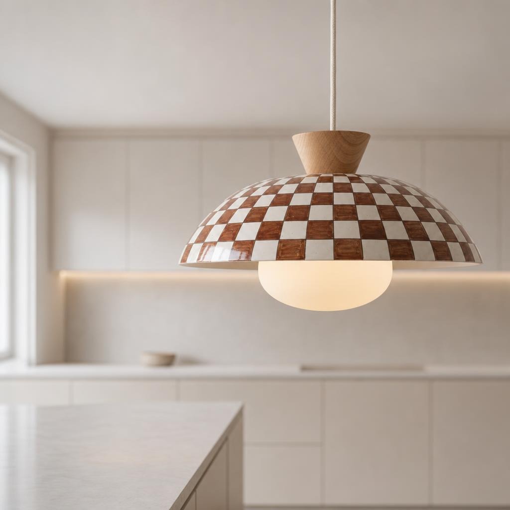
A tiered pendant makes sense when lighting itself should be a focal point. For example, Art Ceramic’s Coral Checker Ceramic Pendant Light with Sculptural Cone Accent uses a conical detail within a more complex tiered composition. It is a useful reminder that a “cone” can be one part of a pendant’s silhouette rather than the entire shade.
Clean geometry
A sharper silhouette that can look graphic above an island or table.
Softly flared
A curved rim offers a gentler transition into a relaxed interior.
Sculptural layers
A stepped profile has a more expressive presence even when unlit.
How Much Light Does a Ceramic Cone Pendant Give?
Shape alone cannot tell you how bright a fixture will be. The most common mistake is treating a product photograph as proof of useful task lighting. Photography shows atmosphere. A lighting plan needs verified performance.
Start with the bulb and the opening
Check the compatible bulb base, maximum permitted wattage, and any restrictions on bulb type. For LEDs, compare
lumens
for overall light output; watts describe electrical use, not brightness.
Then look at the shade opening and the light source position. A small opening can produce a narrower patch of illumination, while a wider opening may distribute light more broadly.
Consider glare and the surface below
At a dining table, comfort matters as much as brightness. Ask whether a seated person can see an exposed bright bulb from across the table. Above a kitchen work surface, consider where your hands cast shadows and whether nearby under-cabinet or general ceiling lights provide enough support.
Think about color temperature For many residential dining and living settings, a warm-white LED around 2700–3000 K creates a comfortable atmosphere. That is a design preference, not a universal requirement. Check whether the product supports replaceable bulbs or an integrated source before buying.
Dimming also requires a compatible bulb, control, and fixture setup. Before ordering: verify the product’s actual electrical rating and installation documentation. Ceramic material, finish, and visual shape cannot establish a fixture’s certification or suitability for a specific home.
Check before you buy: Shade geometry alone does not establish lumen output, beam angle, dimming support, or electrical certification. Confirm product documentation.
Where Ceramic Cone Pendant Lights Work Best
Above a dining table A cone pendant can establish a clear center above a round or rectangular table. If the room has patterned upholstery or expressive artwork, a simple matte or neutral-glazed shade may be enough.
For a quieter dining space, a colored ceramic piece can become the one confident accent. Check the line of sight between people seated across from each other before choosing the final drop. Over a kitchen island
Cones work beautifully in repeated arrangements, but the island’s width, the shade diameter, and your work zones should drive the layout. A compact cone and a broad cone are not interchangeable, even if both appear in a three-pendant arrangement.
We have a separate, more detailed kitchen island pendant spacing guide with practical dimensions and a layout calculator. Use that guide to plan fixture count and suspension height instead of guessing from inspiration photos.
Over a breakfast nook One pendant can give a small nook its own identity, particularly in an open-plan home where the dining corner needs to feel separate without adding walls. Choose a scale that does not overwhelm the table and consider whether the light is comfortable for someone reading or working there. In a hallway or entry
An expressive cone can be appealing where the ceiling is visible from the front door. But corridors are a special case: confirm door swings, headroom, clearance, and the mounting requirements. Never choose a fixture purely for appearance in a circulation zone.
Planning pendants over an island?
Fixture count, spacing, and suspension height deserve their own measurements. Use our dedicated kitchen-island guide for an actual spacing calculator.
How to Pair Ceramic Cones With the Rest of Your Home
Ceramic is especially interesting next to materials that behave differently under light. A glossy glaze reflects highlights; brushed wood absorbs them; stone has its own veining and texture. Matching every color exactly is rarely necessary.
A better approach is to repeat one visual cue while letting the pendant have its own presence. For light oak and warm white kitchens Try sand, ivory, warm terracotta, or a muted green. Those colors sit comfortably beside natural wood without forcing the entire palette into the same tone.
If you want more contrast, a saturated cobalt shade can be striking against pale cabinetry. For dark cabinetry A lighter ceramic shade can establish useful visual separation. Alternatively, a glossy dark color may look intentional against charcoal or navy cabinetry, especially when the surrounding hardware provides a contrasting line. For rooms with plenty of pattern
Let the ceiling fixture settle the composition. Solid glazes or restrained stripes can feel more controlled than adding another large-scale print. In a simple room, though, a graphic pattern is sometimes the most compelling choice. Surface finish matters in person. Glaze photographs change with the light source, monitor, and editing. If a precise material match is important, request the actual product details and compare samples whenever possible.
Choosing a Cone Pendant That Feels Proportional
Start with the finished dimensions of the room and the furniture beneath the fixture. Then compare the pendant’s maximum shade width, full body height, and total available suspension length . A wide shade can dominate a compact nook even if its height is modest.
A tall narrow form can look elegant but interfere with important views if it hangs too low. Do not use a single fixed rule to size every pendant. Instead, test three things: From the doorway: does the silhouette look balanced in the wider room?
From a seated position: is the bulb hidden or comfortable to look toward? From the working position: is the surface illuminated where the activity actually happens?
Cardboard templates or painter’s tape on a temporary overhead reference can help you judge width and drop before purchasing. For multiple fixtures, calculate the space between actual shade edges, not just the gap between electrical boxes. Our island spacing resource walks through that calculation.
A Real Ceramic Piece to Explore
For a playful approach to geometry, take a closer look at the Coral Checker Ceramic Pendant Light with Sculptural Cone Accent . Its coral-and-white checker pattern gives the shade a strong graphic rhythm, while the upper sculptural detail adds dimension above the main body.
This is a design-led option for a kitchen nook or dining area where you want an identifiable accent rather than an invisible ceiling fixture. The product listing describes a glazed ceramic shade with metal suspension hardware. Check the latest measurements, electrical specifications, and suspension details on the product page before deciding whether it suits your space.
If you would rather begin with color and silhouette across several styles, see the complete Art Ceramic pendant collection . Not every fixture there is a conical pendant; compare the actual product descriptions and mounting types carefully.
Seven Details to Confirm Before You Buy
Actual shape: Is the pendant entirely conical, or does it only have a cone accent?
Maximum diameter: Measure the widest part of the shade, including decorative edges.
Fixture height and drop: Check both the shade height and the adjustable suspension range.
Light source: Confirm bulb fitting, permitted wattage, light output options, and dimming compatibility.
Hardware: Verify canopy size, mounting conditions, and whether the fixture is suitable for your ceiling.
Care: Follow finish-specific instructions and never use abrasive cleaners unless expressly allowed.
Location: Confirm indoor/damp/wet-location suitability from actual certification and manufacturer documentation.
Once you can answer those seven questions, finish and color become much easier to choose. If the technical details are unavailable, request them before committing to an installation.
Frequently Asked Questions
Are cone pendant lights good for kitchen islands? Yes, if the shade dimensions, actual light distribution, and suspension work for the island. A cone profile can look particularly clear in a repeated row. The right quantity depends on the real width of the fixtures and the length of the island.
Do ceramic cone pendants make a room feel smaller? Not necessarily. Their effect depends on diameter, color, suspension length, and what else is visible in the room. A wide dark shade may feel more prominent than a compact pale one, even when both use the same basic geometry.
Is a cone pendant brighter than a dome pendant? Not by definition. Brightness and distribution depend on the whole assembly, including the bulb or LED module, the inner surface, the shade opening, any diffuser, and the mounting height. Can I put a ceramic cone pendant in a bathroom?
Only if the specific fixture is rated for the intended bathroom location and the installation meets applicable electrical requirements. Do not assume that ceramic itself makes an electrical fixture moisture-safe. Do cone pendant lights go out of style?
The geometry is simple enough to work across many interiors, but the finish, color, detailing, and proportions influence whether it will feel timeless to you. Choose something that works with the room rather than chasing a passing trend.
How do I clean a ceramic pendant light? Turn it off, let it cool, and use the manufacturer’s care recommendations. A soft dry cloth may be suitable for routine dusting on many glazed surfaces, but avoid moisture around electrical components and confirm cleaning guidance for textured or hand-decorated finishes.
Choose the Light for the Life Around It
A ceramic cone pendant is a small object with a surprisingly large role. It can make a kitchen feel intentional, bring a dining corner into focus, or add a material note to an otherwise minimal room.
But what makes the choice successful is not just its silhouette. It is the relationship between form, usable light, and the daily life unfolding underneath. Start with the room. Measure the furniture. Look at the actual product details.
Then choose the color and shape you will still enjoy when the fixture is switched off. Find a ceramic pendant with presence. Explore color, pattern, and sculptural form across the Art Ceramic collection. Compare actual product specifications before planning your installation. Explore ceramic pendant lights →
On this page
- What Actually Makes a Pendant “Cone-Shaped”?
- Cone, Bell, Dome, or Tiered: Which Silhouette Fits?
- How Much Light Does a Ceramic Cone Pendant Give?
- Where Ceramic Cone Pendant Lights Work Best
- How to Pair Ceramic Cones With the Rest of Your Home
- Choosing a Cone Pendant That Feels Proportional
- A Real Ceramic Piece to Explore
- Seven Details to Confirm Before You Buy
- Frequently Asked Questions
- Choose the Light for the Life Around It
Shop distinctive forms, confident colors and considered finishes.
Sculptural ceramics worth discovering.
The following designs include patterned and tiered ceramic pendants. They are style references—not all true cone shades. Always compare product dimensions and specifications.
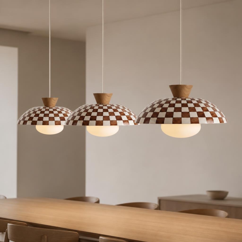
Brown Checkered Ceramic Pendant
A warm patterned accent for thoughtfully restrained interiors.
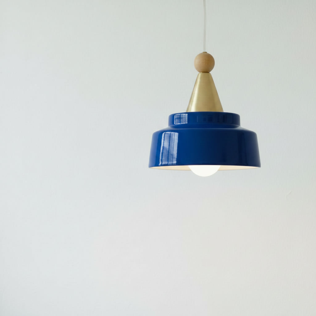
Cobalt Blue Tiered Ceramic Pendant
A reflective, saturated blue shade with a stepped profile.
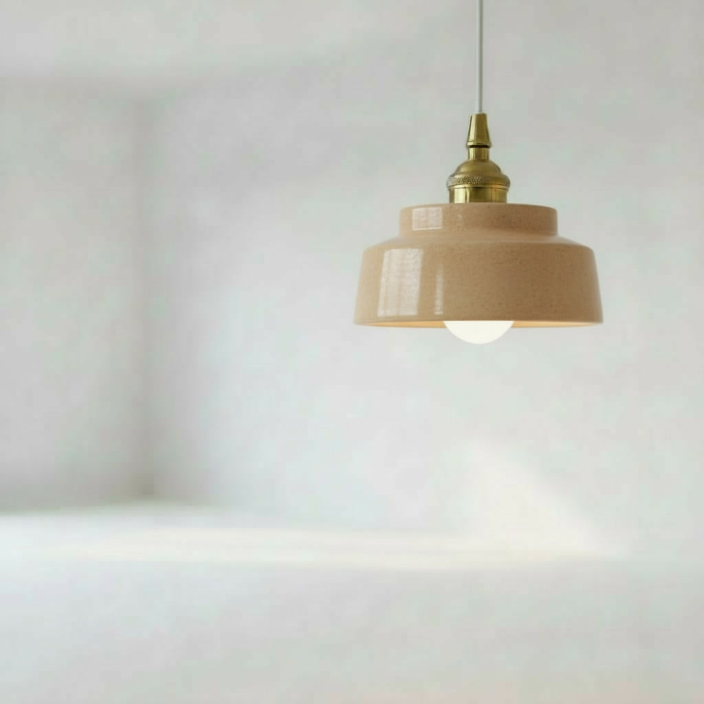
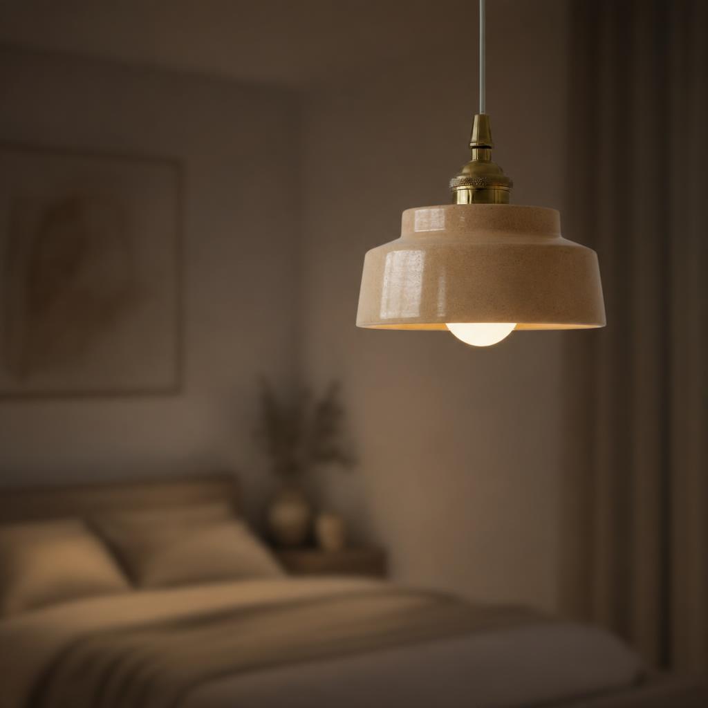
Sand Beige Tiered Ceramic Pendant
A quieter neutral tone for warm modern kitchen palettes.
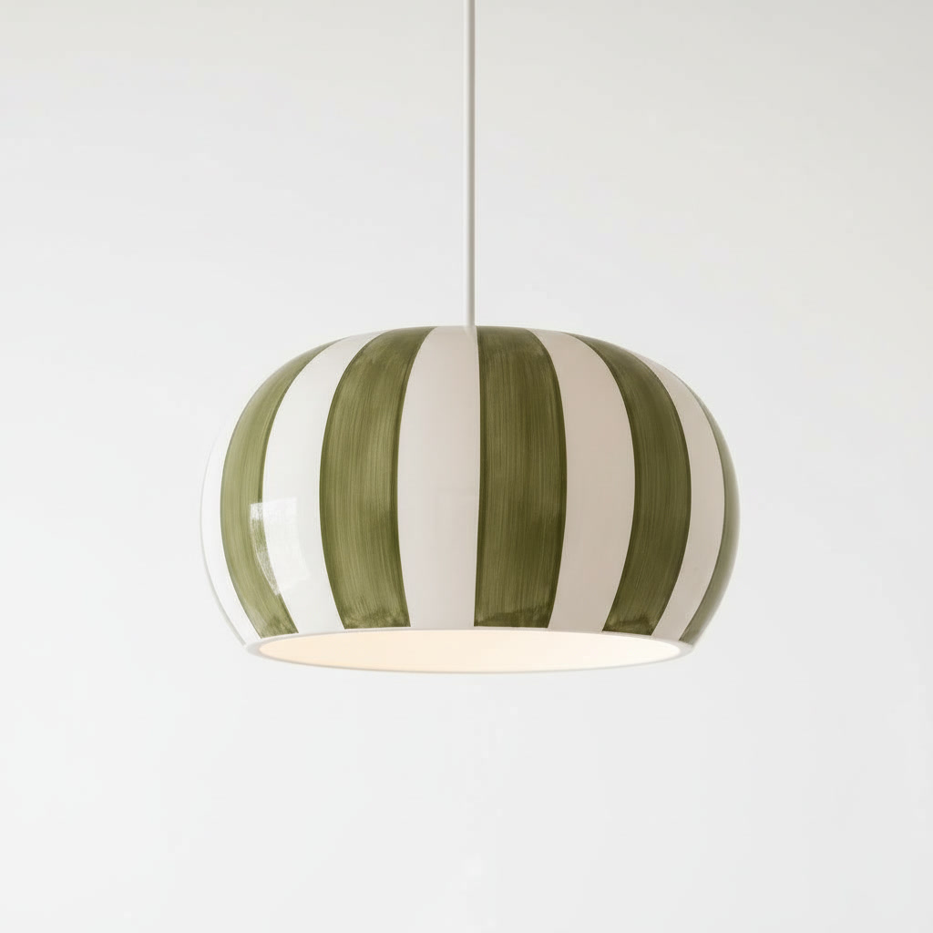
Olive Green Striped Ceramic Pendant
Soft earthy color with a distinctive striped ceramic look.
Bring sculptural light into your space.
Explore sculptural ceramic pendants, considered color and tactile finishes for thoughtfully designed US interiors. Review current delivery availability and product specifications directly in the store.