 Skip to navigation
Skip to main content

How to Choose & Space Ceramic Pendant Lights Over Your Kitchen Island
Ceramic pendant lights kitchen island spacing depends on island length, shade diameter, and visual balance. Start with two or three pendants where proportions allow, keep their centers evenly spaced, and use 30–36 inches above the countertop as an initial hanging-height reference.
A considered guide to island proportions, lighting height, sculptural ceramic finishes and beautifully balanced layouts.
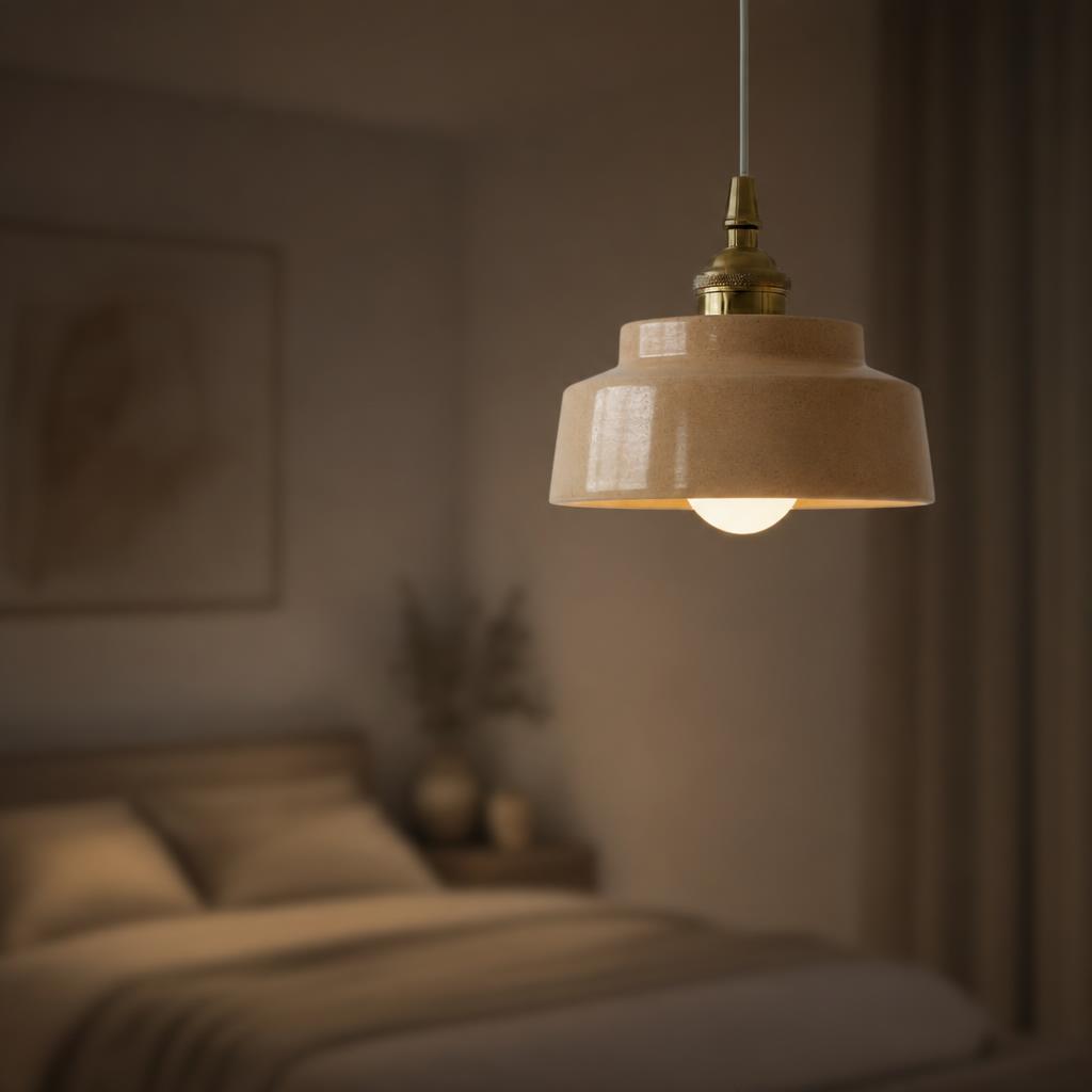
A kitchen island is more than a work surface. It is where morning rituals unfold, where meals begin and where the architecture of a home becomes part of everyday life.
The best ceramic pendant lights for kitchen islands respond to this space on two levels. They give the countertop purposeful light, and they bring proportion, material depth and a sense of artistry to the room.
Yet a beautiful pendant can lose its impact when its shade is too small, its suspension too low or its companions too closely grouped. Thoughtful lighting begins with the dimensions of the island—not the number of fixtures in a catalog photo.
Below, we explore the complete planning process: the rule of three, accurate spacing formulas, kitchen island pendant light height, shade scale, task illumination, and the warmth of glazed ceramic.
“The most beautiful kitchen lighting feels deliberately placed, even when the room is at its simplest.”
Why Ceramic Pendant Lighting Belongs in a Warm Modern Kitchen
Warm modernism balances clean architectural lines with materials that feel considered rather than clinical. Stone countertops, quiet cabinetry and natural finishes provide the backdrop; ceramic introduces a sculptural counterpoint.
Unlike a purely utilitarian ceiling light, a ceramic pendant can remain visually compelling long after it is switched off. Its shape and glaze make the shade a small piece of functional art suspended above the island.
Material character without visual noise
Ceramic shades range from smooth monochromatic forms to patterned, ridged and textured profiles. A single expressive ceramic finish may be all the room needs, especially when other surfaces are deliberately restrained.
- Glossy glazes: reflective highlights that emphasize curves and stepped silhouettes.
- Matte finishes: softer reflections for tactile, low-contrast rooms.
- Patterned shades: graphic detail that can serve as the kitchen’s principal accent.
- Sculptural profiles: cone, bell, dome and tiered forms that add architectural rhythm.
Warm minimalism is not the absence of detail. It is the careful choice of details that deserve attention. When ceramic is the feature, allow space for its finish and silhouette to be appreciated.
Ceramic Pendant Lights Kitchen Island Layouts: 1, 2 or 3 Fixtures?
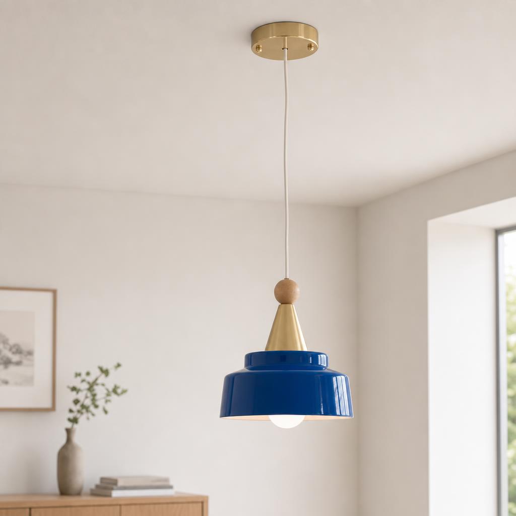
The number of pendants you choose should follow the island length, the width of each ceramic shade and its visual weight. A deep cobalt glaze, for example, may read more prominently than a pale neutral shade of the same size.
The familiar rule of three is a useful compositional idea, not an obligation. Three small fixtures can create linear symmetry, while two larger pendants often feel quieter and more generous.
These are planning ranges, not installation standards. A wide ceramic shade can require more separation than a narrow one. Always plan with the manufacturer's actual dimensions.
When two pendants feel more refined
Two pendants suit wide or visually substantial shades. They give each ceramic form enough breathing room and can frame a 6–8-foot island without creating a busy ceiling line.
Choose a pair when cabinetry, a statement stone slab or architectural detailing already commands attention. The aim is dialogue between materials, not competition.
When the rule of three creates harmony
Three pendants are compelling when the island is long and the shades are relatively compact. Even repetition establishes a consistent beat across the countertop.
But avoid choosing three merely because the number looks traditional. If the clear gaps become too small, move to two larger fixtures rather than crowding the composition.
Two statement shades
Wider silhouettes, fewer visual interruptions and generous symmetry.
Three compact shades
A rhythmic, repeated composition suited to longer islands.
How to Space Ceramic Pendant Lights over a Kitchen Island
Begin with two measurements: center-to-center spacing and the clear gap between the shade edges. These are not the same thing. Broad ceramic pendants can feel crowded even when their centers are comfortably separated.
Measure
Record the finished island length and width in inches.
Choose
Use the real maximum shade diameter, not a guessed size.
Balance
Set matching end margins and equal center intervals.
Spacing formula for two or more pendants
If the first and last pendant centers have equal end margins, calculate their center-to-center spacing with this simple formula:
Measure in inches.
For two or more fixtures.
Example: A 96-inch island with three pendants and 18-inch end margins leaves 60 inches between the outer pendant centers. Divide by two intervals, and the center spacing is 30 inches.
Now subtract the diameter of each equal-width shade. With 12-inch shades, the clear edge-to-edge gap is approximately 18 inches.
Check the width as well as the length
An island that is 96 inches long but only 30 inches wide creates different proportions from one measuring 48 inches across. The pendants should sit above the useful lighting zone without visually swallowing the entire counter.
Review sightlines from the kitchen entrance, dining area and primary preparation position. The arrangement should look balanced in plan and elevation.
Kitchen Island Pendant Spacing Calculator
Use this calculator to explore symmetrical layouts before choosing your fixtures. The result is a starting point for design planning, not an electrical installation specification.
Plan your pendant layout.
Change the measurements to see pendant centers and shade-edge clearance.
Always verify shade diameter, ceiling hardware, clearances and electrical instructions with your installer.
Kitchen Island Pendant Light Height: The Designer's Starting Point
For many conventional residential kitchens, the hanging height for kitchen island pendants starts at approximately 30–36 inches above the countertop, measured to the lowest point of the fixture.
This guidance is a starting range—not an automatic installation rule. Ceiling height, shade profile, countertop use and views across the room all influence the final decision.
Measure from the counter, not from the ceiling
First measure from the finished countertop to the bottom edge of the proposed pendant. Then calculate the total suspension needed from the ceiling. This sequence protects the working clearance while preserving the fixture’s intended proportions.
Keep important sightlines open
Look across the island while standing in the kitchen, and again while seated on the other side. A beautiful shade should not repeatedly interrupt faces, conversations or views into adjoining living spaces.
A broad pendant may need to sit slightly higher than a narrower one. Always test with the actual fixture dimensions and consult the installation requirements.
Understand cord suspension and ceiling height
Taller ceilings may create an opportunity for a more expressive vertical composition. Still, a longer drop is not always better. The relationship to the countertop and the people using it matters most.
Before buying, check whether a fixture has an adjustable suspension system. Never assume a cord can be modified or that the same assembly suits sloped ceilings or all electrical boxes.
Use a qualified electrician and follow the fixture's verified documentation, electrical ratings and applicable local requirements. The distances above describe common design practice, not a substitute for electrical safety instructions.
Choose a Ceramic Shade That Fits the Island — and the Room
Shade diameter alone does not tell the whole story. A compact cylinder and a wide bell-shaped shade can share a similar footprint but carry very different visual weight.
Consider the silhouette
- Conical ceramic shades: graphic, directional profiles with a clean outline.
- Bell-shaped shades: softer curves with a familiar, welcoming form.
- Tiered ceramic shades: a sculptural stepped profile that adds architectural dimension.
- Patterned ceramic: an intentional decorative statement that pairs well with restrained cabinetry.
Dark, saturated glazes often feel more visually prominent than pale finishes, even at the same size. Glossy surfaces also catch light differently from matte ones, creating distinct specular highlights along the ceramic curves.
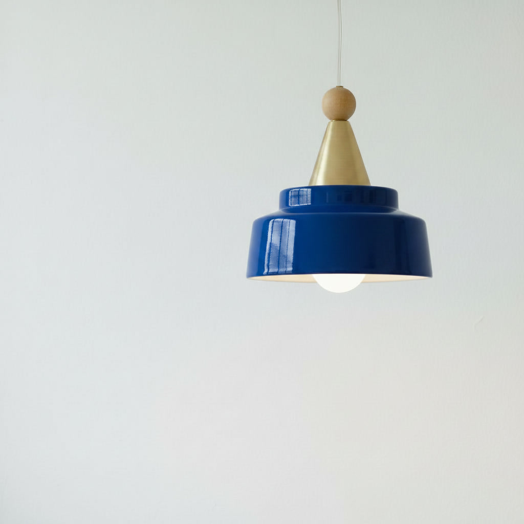
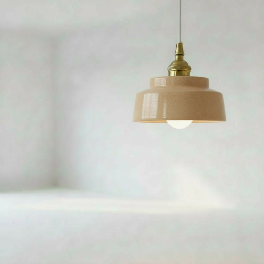
Think of the pendants as an ensemble. Their scale should support the island’s mass, while their color can either complement the material palette or become a restrained point of contrast.
Task Illumination, Ambient Glow & Layered Kitchen Lighting Layouts
Kitchen island pendants should be beautiful, but they also need to support how the surface is used. An island for food preparation has different lighting priorities from one primarily used for serving or conversation.
Task illumination that supports real work
A downward-facing ceramic shade may direct light toward the countertop, but useful task illumination depends on the complete assembly: bulb lumen output, beam spread, mounting height, shade opening and fixture spacing.
Consider shadows cast by people working at the island. A row of pendants may produce attractive pools of light while still leaving some preparation areas unevenly illuminated.
Ambient lighting for evenings
Ambient lighting gives the whole kitchen a comfortable background level of brightness. It may come from ceiling fixtures, reflected light or other architectural sources.
When the appropriate bulbs and controls allow it, dimmable lighting can shift an island from practical daytime use to a gentler evening atmosphere.
Build a complete lighting plan
- Under-cabinet lighting: a dedicated layer for preparation counters.
- Island pendants: a decorative and potentially task-focused overhead layer.
- General ceiling lighting: broader illumination for movement and circulation.
- Wall and table lighting: supplemental light around adjoining dining and living zones.
Separate compatible lighting circuits help adapt the room over the course of the day. For adjoining spaces, our ceramic wall sconces and ceramic table lamps can extend a material-led aesthetic beyond the island.
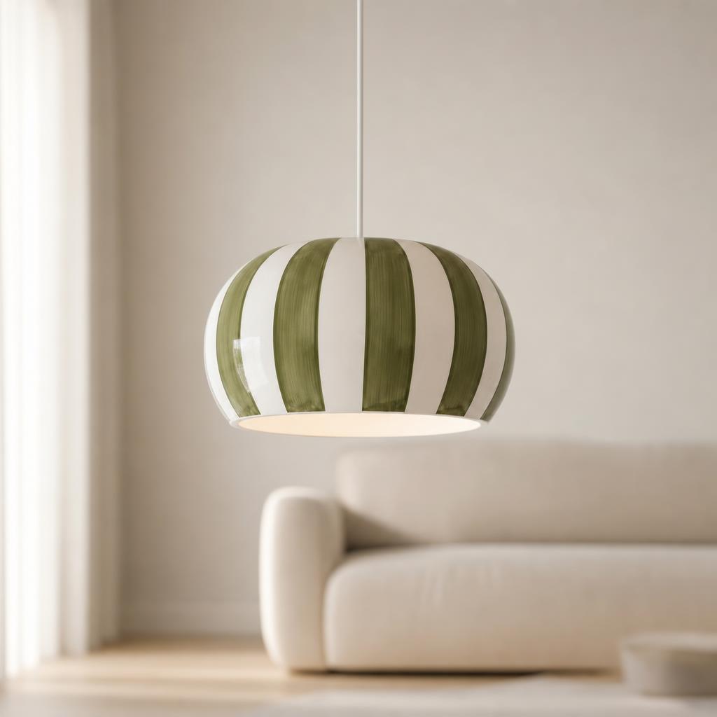
Glazed, Matte or Patterned? Understanding Ceramic Character
Ceramic lighting is compelling because shape and surface work together. A glaze can amplify the roundness of a shade, while a quieter finish may emphasize its silhouette and tactile quality.
Glossy ceramic and light reflection
A glossy finish creates visible reflected highlights, especially on curved surfaces. This can make a blue, green or richly colored pendant feel more sculptural throughout the day.
Matte surfaces and warm minimalism
Matte ceramic often feels understated against limewash-inspired walls, natural stone and soft neutral cabinetry. These pairings can create warmth through tonal variation rather than strong contrast.
Premium stoneware, vitrified bodies and honest materials
Stoneware describes a class of ceramic bodies, while vitrification refers to changes that reduce porosity during firing. Glaze is a distinct surface layer. A shiny shade does not prove a particular clay body, firing temperature or glazing technique.
If artisanal provenance, premium stoneware or a vitrified glaze matters to your project, request the manufacturer’s actual specifications. A reliable design decision rests on verified information, not assumptions based on appearance.
For routine cleaning, start with the manufacturer’s care instructions. Switch off the fixture, allow it to cool and avoid aggressive or abrasive cleaners unless the finish instructions explicitly permit them.
A Patterned Accent: Brown Checkered Ceramic Pendant Lighting
Not every warm modern kitchen calls for a monochrome shade. A brown-and-cream checked ceramic pendant can bring graphic rhythm to a space built around stone, pale cabinetry and organic textures.
The Brown Checkered Ceramic Pendant Light from Art Ceramic offers a distinctive patterned direction. Its checkered ceramic surface becomes a design detail without requiring the entire room to adopt a bold palette.
Use it as an accent against cream cabinetry, oak-toned furniture or a softly veined countertop. For a kitchen island, choose the quantity and placement only after confirming the product’s exact measurements and suspension options.
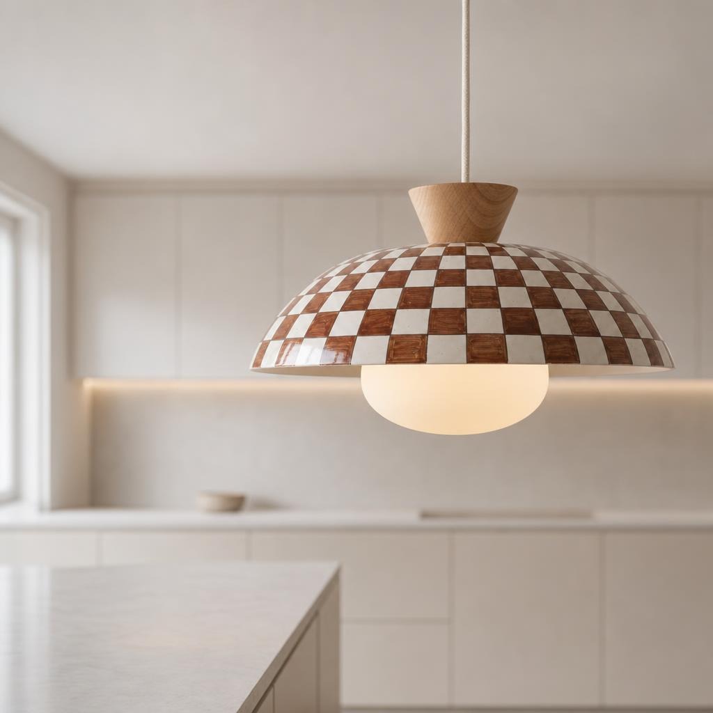
Pattern with a quiet point of view.
A graphic brown-and-cream ceramic design brings detail to pared-back interiors without overwhelming natural surfaces.
Explore the actual product gallery and check available fixture details before selecting a kitchen island arrangement.
For a broader comparison, browse our ceramic pendant lights collection, or explore modern ceramic pendant lights across the Art Ceramic website.
Five Common Kitchen Island Pendant Mistakes
1. Choosing a pendant count before measuring
A rule-of-three arrangement can look appealing in a photograph yet feel crowded above a smaller island. Choose the shade size and island proportions first.
2. Confusing center spacing with shade-edge clearance
A 30-inch center interval does not mean a 30-inch visual gap. Subtract the shade diameter to understand how much breathing room the fixtures really have.
3. Hanging too low across key sightlines
Even a beautifully shaped ceramic shade can interrupt a room if placed at face height. Test views between standing and seated positions before final installation.
4. Expecting pendants to do all the work
Decorative pendants alone may not adequately illuminate preparation zones. Plan coordinated overhead and under-cabinet layers based on the room’s actual needs.
5. Ordering without verifying technical details
Check dimensions, suspension length, bulb compatibility, electrical ratings, mounting hardware and installation instructions. Product photography cannot establish any of these values reliably.
On this page
Shop distinctive forms, confident colors and considered finishes.
Ceramic pendants worth a closer look.
Real Art Ceramic product photographs, linked directly to their product pages. Explore each fixture’s available finish and specifications before planning the installation.
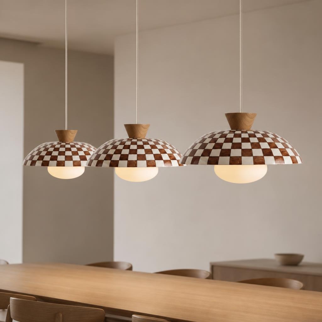
Brown Checkered Ceramic Pendant
A warm patterned accent for thoughtfully restrained interiors.
Cobalt Blue Tiered Ceramic Pendant
A reflective, saturated blue shade with a stepped profile.
Sand Beige Tiered Ceramic Pendant
A quieter neutral tone for warm modern kitchen palettes.
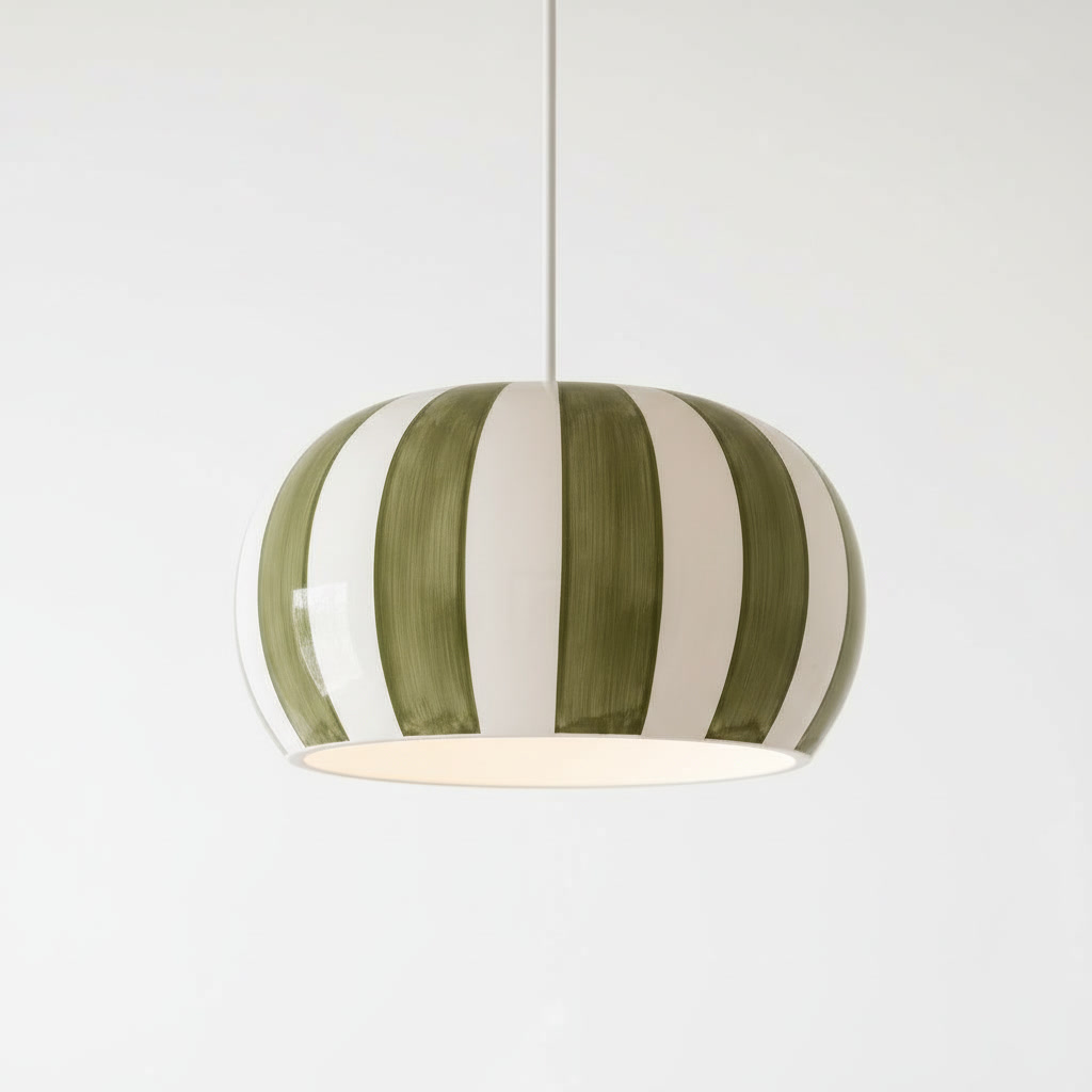
Olive Green Striped Ceramic Pendant
Soft earthy color with a distinctive striped ceramic look.
The Kitchen Island Pendant Planning Checklist
Before ordering fixtures or arranging an installation, review these essentials. A beautifully designed kitchen depends on the small practical choices behind the final composition.
- Measure the finished island length and width.
- Confirm each shade’s maximum diameter and full fixture height.
- Select one, two or three pendants based on scale—not a fixed rule.
- Calculate equal end margins and center-to-center spacing.
- Check clear gaps between neighboring ceramic shades.
- Begin with the 30–36-inch countertop clearance range and adjust for sightlines.
- Confirm suspension adjustability and suitable electrical mounting details.
- Plan preparation lighting and general room illumination separately.
- Review the color and glaze against countertop and cabinet samples.
- Check the manufacturer’s real care, bulb and installation specifications.
Frequently Asked Questions
Approximately 30–36 inches from the finished countertop to the fixture’s lowest point is a common starting range. Fine-tune for ceiling height, shade size, clear sightlines and the manufacturer’s installation requirements.
Use the island length, shade diameter and matching end margins to calculate equal center intervals. A common planning range is roughly 24–36 inches between fixture centers, but wider shades may need more room. Check the actual shade-edge gap.
Both can work. Two substantial pendants create a simpler visual composition, while three smaller fixtures establish repeated rhythm. Prioritize the shade diameter, spacing and countertop lighting rather than a fixed pendant count.
No. The rule of three is a composition technique, not a requirement. One well-scaled fixture or two sculptural pendants may be more appropriate for some islands.
Choose in relation to island length and width, then check visual weight. Broad tiered or flared ceramic shades can look larger than slender forms with similar listed diameters. Use confirmed product measurements.
Yes, depending on the fixture and light source. Useful countertop lighting depends on lumen output, shade opening, beam distribution, hanging height and the rest of the kitchen’s lighting plan.
Yes. A glossy ceramic shade can provide a purposeful material contrast with matte cabinetry, stone and other restrained surfaces. Match its color and scale to the room’s overall composition.
Yes. Coordinated wall, ceiling and table lighting can create comfortable layers across connected living areas. You do not need identical colors; repeating ceramic as a shared material can provide continuity.
Thoughtful Spacing Is Where the Beauty Begins
A beautiful ceramic pendant is only part of a successful kitchen island arrangement. The rest comes from understanding the relationship between the shade, the countertop and the people moving through the room.
Start with your island length. Choose a fixture count that feels proportionate. Set comfortable center spacing and clear shade gaps. Then test the hanging height against real sightlines and the practical needs of food preparation.
That process creates more than symmetry. It creates a kitchen that feels resolved: useful by day, welcoming by evening and quietly expressive through materials that deserve to be seen.
General height and planning ranges cross-checked against
. Numbers are design starting points; fixtures and installations require verified specifications. Inspiration photography from
sources; branded product photography from Art Ceramic’s own store.
Make the light
part of the architecture.
Explore sculptural ceramic pendants, considered color and tactile finishes for thoughtfully designed US interiors. Review current delivery availability and product specifications directly in the store.